When most people sit down to plan their podcast, they think about the big stuff first — who they’re going to interview, what topics they’ll cover, how they’ll edit the audio, and which platform they’ll publish on. Graphics? That tends to be an afterthought. Something to sort out in the last ten minutes before hitting publish, usually with a quick Canva template and a crossed-fingers approach to design.
But here’s the thing: your podcast graphic is the very first thing a potential listener sees. Before they’ve heard a single word of your show, before they’ve read your episode description, before they’ve even registered your name — they’ve already formed an impression based on your thumbnail. And in a feed full of competing shows, that impression either earns a click or loses one.
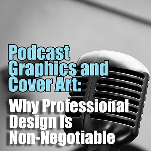
In Episode 3 of Podcasts Done For You — The Show, Anthony Perl makes the case for treating podcast graphics as a serious strategic investment, not an afterthought. Here’s everything you need to know.
Start With a Professional — It’s Worth Every Dollar
Anthony’s first and most emphatic tip is this: if you can afford it, hire a professional graphic designer. Not to do every single graphic forever, but at minimum to set up your initial templates and establish your visual system. Once those foundations are in place, you have a consistent, on-brand starting point that you can adapt for each episode going forward.
The temptation to jump onto Canva and knock something together yourself is understandable — it’s fast, it’s free, and the templates look decent enough. But as Anthony puts it, “you’re playing amateur hour when you’re just doing it yourself.” The tools are accessible to everyone, which means the barrier to entry is low. What separates a great podcast graphic from a forgettable one isn’t access to software — it’s design sensibility, brand understanding, and the ability to make intentional choices about typography, colour, composition, and hierarchy. Those are skills that take time to develop, and a professional designer brings them to the table from day one.
Think of it as laying the platform. The upfront investment in professional design pays dividends every time you publish a new episode, because you’re working from a system that already looks polished and intentional rather than starting from scratch each time.
The Three Brands You Need to Think About
One of the most useful frameworks Anthony introduces in this episode is the idea that every podcaster is actually managing three distinct brands simultaneously: their personal brand, their business brand, and their podcast brand.
Your personal brand is how you present yourself — your image, your style, your values, the way you show up in the world. Your business brand is the visual and verbal identity of your company. And your podcast brand is the specific identity of the show itself, which may or may not align neatly with either of the other two.
Here’s the important part: these three brands don’t have to be identical, but they do need to be compatible. If you’re going to appear in your podcast graphics — which Anthony strongly recommends — then your personal brand and your podcast brand must be aligned. You can’t have a polished, corporate business brand and then show up in your podcast graphics looking like you threw something together on your lunch break.
What’s interesting is that the podcast brand often has more flexibility than the business brand. It can sit alongside the business, reference it, and complement it, while still having its own distinct personality and visual language. Many podcasters find that their show becomes a separate but connected entity — its own website, its own aesthetic, its own audience — that feeds back into the business in a powerful way. The key is to be intentional about how these brands relate to each other from the very beginning.
Professional Photography: The Foundation of Great Podcast Graphic
If you’re going to feature yourself in your podcast graphics — and Anthony believes you should, wherever possible — then professional photography is non-negotiable. Not a selfie. Not a screenshot from a Zoom call. A proper professional photoshoot, done with your podcast graphics specifically in mind.
What does that mean in practice? It means thinking ahead about the kinds of images you’ll need. Vary your outfits across the shoot so you have options for different episodes. Capture a range of expressions and poses — including those dynamic hand gestures and different angles that you see in the thumbnails of top-performing YouTube channels. Think about the backgrounds and settings that will work with your brand’s colour palette and mood.
Anthony points to Steven Bartlett of Diary of a CEO as an example of someone who has made a very deliberate choice to wear the same style of outfit consistently, creating an instantly recognisable visual signature. That works brilliantly for his brand. But if that’s not the direction you want to go, you need to plan for variety — and the time to do that is during the photoshoot, not after the fact when you’re trying to make episode 47 look different from episode 46.
The goal is to build a library of professional images that give you flexibility and consistency at the same time. Flexibility to vary the look from episode to episode. Consistency to ensure that every graphic is unmistakably yours.
Do You Actually Need Photographs?
Not every podcaster wants to be front and centre in their graphics, and that’s a completely valid choice. There are plenty of successful shows that use abstract imagery, branded illustrations, bold typography, or thematic visuals rather than photographs of the host. If you’re genuinely averse to having your photo taken, or if your brand lends itself to a more conceptual visual approach, you can absolutely go down that path.
The important thing, as Anthony notes, is to still ensure variety. Even if you’re not using photographs, your graphics need to look different enough from episode to episode — particularly on YouTube — to catch the eye and signal that there’s something new and worth watching. Generic, identical graphics across every episode will blend into the background and fail to attract attention.
If you do have guests on your show, Anthony suggests thinking carefully about how you incorporate their images. Many guests will have professional photographs available — either on their website, their LinkedIn profile, or their own media kit. If not, consider taking some stills at the end of the recording session. The key principle here is that even when featuring a guest, your brand needs to remain front and centre. The graphic should still be unmistakably your show, with the guest featured as a compelling reason to tune in — not the other way around.
Designing for Different Platforms: YouTube vs. Everything Else
One of the most practically useful sections of this episode is Anthony’s breakdown of how to think about graphics differently depending on the platform.
For Spotify, Apple Podcasts, and Amazon Music, the dynamic is quite different from YouTube. On these platforms, people generally arrive already knowing what they’re looking for. They’ve been recommended a show by a friend, they’ve heard about it somewhere, or they’re returning to a podcast they already follow. They’re not browsing visually in the same way — they’re searching by name or scrolling through episode titles. In this context, having identical or near-identical graphics for every episode is perfectly acceptable. The visual consistency actually reinforces brand recognition rather than working against it.
YouTube is a completely different story. On YouTube, your thumbnails appear side by side in your channel feed, and they also appear in search results and recommended video sections alongside content from completely different creators. If every thumbnail looks the same, your channel feed becomes a wall of repetition that fails to signal variety or momentum. Worse, in search results, a generic or low-effort thumbnail will lose out to a more dynamic, eye-catching one every single time.
This is why Anthony recommends that if you’re publishing on YouTube, you invest in creating distinct, episode-specific thumbnails that vary in composition, imagery, and text treatment — while still maintaining the core brand elements that make them recognisably yours. It’s a higher production overhead, but the payoff in terms of click-through rates and discoverability is significant.
The Text on Your Graphic: Less Is Almost Always More
There’s a strong temptation when designing podcast graphics to pack in as much information as possible — the episode title, the guest name, the episode number, the podcast name, a tagline, and whatever else seems relevant. Resist this temptation.
The vast majority of people viewing your podcast graphics are doing so on a mobile phone. The screen is small, the thumbnail is smaller, and a graphic crammed with text becomes illegible at that scale. Remember that the episode title and podcast name will appear as text below the graphic anyway — you don’t need to duplicate that information in the image itself.
Anthony’s advice is to distil your graphic text down to the absolute essentials. If you have a well-known guest, their name might be all you need. If the episode is topic-driven, choose the most compelling two or three words that capture the core idea. Avoid the word “podcast” — anyone looking at your graphic already knows it’s a podcast. And think very carefully before including episode numbers. As Anthony points out, episode numbers can actually work against you by making new listeners feel like they’ve missed too much to catch up, even though most podcasts don’t require sequential listening at all.
The goal is to use the limited real estate of a thumbnail to communicate one clear, compelling idea that makes someone want to click. Bold, readable typography. Strong contrast. A clear focal point. Everything else is noise.
AI Tools, Canva, and the Limits of Templates
Anthony addresses the growing question of AI-generated graphics and tools like Canva with a nuanced perspective. These tools have their place — they’re accessible, they’re improving rapidly, and they can be genuinely useful for creating variations and iterating quickly. But they come with real limitations.
The first limitation is that AI-generated imagery often has a tell — a certain quality that signals to viewers that it’s artificially generated. Depending on your audience and your brand, that may or may not be a problem. But if you’re using AI tools primarily because you want to avoid getting professional photographs taken, that’s the wrong reason, and it will likely show.
The second limitation is more fundamental: having access to a design tool is not the same as having design ability. Templates make it easy to produce something that looks acceptable, but “acceptable” is not the same as “on brand” or “strategically effective.” The best templates in the world won’t compensate for a lack of design thinking about what your brand actually needs to communicate and how.
This is why Anthony keeps coming back to the same recommendation: invest in a professional designer at the outset to establish your visual system. Once that foundation is in place, tools like Canva become genuinely useful for executing within that system. Without the foundation, you’re just guessing.
Refreshing Old Graphics: An Underrated Strategy
One of the more surprising tips in this episode is Anthony’s suggestion to periodically go back and refresh the graphics on older episodes — particularly on YouTube. Because YouTube functions as a search engine, older episodes continue to surface in search results long after they were originally published. A refreshed, more compelling thumbnail on an episode from two years ago can attract new clicks and new listeners who would never have found it otherwise.
This is a low-effort, high-potential strategy that most podcasters never think about. It doesn’t require re-recording anything or changing the content — just updating the visual presentation to reflect what you now know about what works for your audience. If you’ve learned that a particular style of thumbnail performs better, apply that learning retroactively to your back catalogue and watch what happens.
The Bottom Line
Podcast graphics are not a nice-to-have. They are a core part of your podcast’s brand identity, your discoverability strategy, and the first impression you make on every potential listener. Getting them right from the start — with professional photography, a professional designer, and a clear understanding of how your personal, business, and podcast brands relate to each other — sets the foundation for everything that follows.
As Anthony summarises: be on brand, get professional photographs, and use a professional graphic designer to get you started. Everything else flows from there.
And don’t forget to grab the free Podcast Thumbnail & Cover Art Guide from the show notes — it’s packed with sizing specifications, platform requirements, and real-world examples from some of the world’s top podcasts to give you a clear reference point as you build your own visual strategy.
Podcasts Done For You helps business owners and experts create professional podcasts — from strategy and recording through to editing, publishing, graphics, and social media. To find out more or book a strategy session, visit podcastsdoneforyou.com.au